feat(emotion,ui-scripts): resolve tokens studio color modifiers and emit hex#2626
feat(emotion,ui-scripts): resolve tokens studio color modifiers and emit hex#2626HerrTopi wants to merge 2 commits into
Conversation


|
Visual regression report
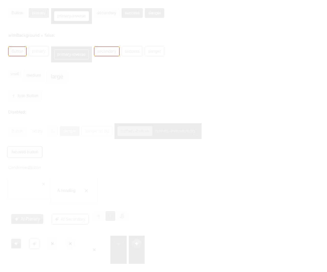
Diff images (1)button-and-derivatives.png — 440 pixels differBaselines come from the |


 ToMESSKa
left a comment
ToMESSKa
left a comment
ToMESSKa
left a comment
There was a problem hiding this comment.
This type of override does not not work unless you change both keys (Button and IconButton) to BaseButton, but that results in not being able to override the two components separately.
<InstUISettingsProvider
    themeOverride={{
      components: {
        Button: { primaryBackground: 'red', smallPaddingTop: '1px' },
        IconButton: { primaryBackground: 'blue', secondaryBackground: 'green' }
      }
    }}

  >
    <Button color="primary">x</Button>
  <IconButton color="primary">x</IconButton>
  </InstUISettingsProvider>

|
Also a similar example, this only works if both key is TreeBrowserTreeButton. Also in some cases the component key used in the InstUISettingsProvider changed:
For example here only the Palette key can be used instead of ColorMixer.Palette (v1). The question is: should my codemod I'm working on handle these key changes or should we change something in the InstUI code? |


…mit hex

Forward Tokens Studio color modifiers (`$extensions.studio.tokens.modify`) through
the theme build scripts and resolve them at theme-apply time so semantic and
component tokens can chain darken/lighten/alpha.

- generateSemantics: emit the `{ value, modify }` payload for semantic tokens and
  recurse into it in resolveReferences (drop the `.value`/`.type` guard that
  serialized the payload to "[object Object]").
- generateComponents: only forward `$extensions` when `studio.tokens.modify` is
  present, so tokens carrying unrelated metadata no longer emit `modify: undefined`.
- applyColorModifiers: serialize the resolved color to hex (`#RRGGBBAA` when alpha
  < 1, `#RRGGBB` otherwise) so modifier-derived values match every other token.
- useComputedTheme/useStyleNew/withStyleNew: resolve modifiers on semantics before
  building component and shared tokens, so component-level modifiers chain on top
  of already-resolved semantic values; key component overrides by the component's
  own id rather than the token-source id.
- Bump @instructure/instructure-design-tokens to v1.4.0.

🤖 Generated with [Claude Code](https://claude.com/claude-code)

Co-Authored-By: Claude <noreply@anthropic.com>
 HerrTopi
force-pushed
the
theming-touchups
branch
from
HerrTopi
force-pushed
the
theming-touchups
branch
from
a17a4e0 to
699c2d8
Compare
…component

Merge the SettingsProvider component overrides with the resolved
themeOverride prop and pass the result down as `themeOverride`, so nested
components receive the effective overrides. Default missing overrides to
an empty object to avoid merging undefined.

🤖 Generated with [Claude Code](https://claude.com/claude-code)

Co-Authored-By: Claude <noreply@anthropic.com>
HerrTopi
force-pushed
the
theming-touchups
branch
from
699c2d8 to
c6a0526
Compare
ToMESSKa
left a comment
ToMESSKa
left a comment
There was a problem hiding this comment.
Looks good now, these overrides work now:
const Example = () => {
    const [color, setColor] = useState('#328826')
    const [wide, setWide] = useState(true)

    return (
      <InstUISettingsProvider
        themeOverride={{
          components: {
            Button: { primaryBackground: 'rebeccapurple' },
            IconButton: { primaryBackground: 'rebeccapurple' },
            CondensedButton: { primaryGhostColor: 'rebeccapurple' },
            CloseButton: { secondaryGhostColor: 'rebeccapurple' },
            CheckboxFacade: { backgroundCheckedColor: 'magenta' },
            ToggleFacade: { checkedBackgroundColor: 'magenta' },
            NumberInput: { arrowsBackgroundColor: 'red' },
            'ColorMixerPalette': { paletteBorderWidth: '0.5rem' },
            'ColorMixerSlider': {indicatorBorderColor: 'magenta' },
            'ColorMixerRGBAInput': { rgbaInputTopMargin: '7rem' },
            'TreeBrowserButton': { hoverBackgroundColor: 'red' },
            'TreeBrowserNode': { hoverBackgroundColor: 'blue' },
            'TreeBrowserCollection': { baseSpacingMedium: '2rem' },
            'TopNavBarDesktopLayout': { desktopBackground: 'red' },
            'TopNavBarSmallViewportLayout': { smallViewportBackground: 'blue' }
          }
        }}
      >
        <View as="div" display="block" padding="small">
  <Button color="primary" margin="0 x-small 0 0">Button</Button>
  <CondensedButton color="primary" margin="0 x-small 0 0">Condensed</CondensedButton>
  <IconButton color="primary" screenReaderLabel="Add" margin="0 x-small 0 0">
    <IconAddLine />
  </IconButton>
  <CloseButton screenReaderLabel="Close" />
</View>

        <View as="div" display="block" padding="small">
          <Checkbox label="Simple checkbox" defaultChecked />
          <Checkbox label="Toggle" variant="toggle" defaultChecked />
        </View>

        <View as="div" display="block" padding="small" maxWidth="12rem">
          <NumberInput renderLabel="Amount" />
        </View>

        <View as="div" display="block" padding="small">
          <ColorMixer
            value={color}
            onChange={setColor}
            rgbRedInputScreenReaderLabel="Red"
            rgbGreenInputScreenReaderLabel="Green"
            rgbBlueInputScreenReaderLabel="Blue"
            rgbAlphaInputScreenReaderLabel="Alpha"
            colorSliderNavigationExplanationScreenReaderLabel="Arrow keys adjust hue"
            alphaSliderNavigationExplanationScreenReaderLabel="Arrow keys adjust alpha"
            colorPaletteNavigationExplanationScreenReaderLabel="Arrow keys move picker"
          />
        </View>

        <View as="div" display="block" padding="small">
          <TreeBrowser
            rootId={1}
            defaultExpanded={[1, 2]}
            collections={{
              1: { id: 1, name: 'Grade 1', collections: [2] },
              2: {
                id: 2,
                name: 'Math',
                collections: [],
                items: [1, 2],
                renderAfterItems: (
                  <TreeBrowser.Node itemIcon={<IconAddLine />}>More</TreeBrowser.Node>
                )
              }
            }}
            items={{
              1: { id: 1, name: 'Can add' },
              2: { id: 2, name: 'Can subtract' }
            }}
          />
        </View>

        <View as="div" display="block" padding="small">
          <Button onClick={() => setWide(!wide)} margin="0 0 small 0">
            {wide ? 'TopNavBar → small viewport' : 'TopNavBar → desktop'}
          </Button>
          <div style={{ width: wide ? '700px' : '360px', border: '1px dashed gray' }}>
            <TopNavBar breakpoint={480} mediaQueryMatch="element">
              {() => (
                <TopNavBar.Layout
                  navLabel="Main navigation"
                  smallViewportConfig={{
                    dropdownMenuToggleButtonLabel: 'Toggle menu',
                    dropdownMenuLabel: 'Main menu'
                  }}
                />
              )}
            </TopNavBar>
          </div>
        </View>
      </InstUISettingsProvider>
    )
  }

  render(<Example />)
2 participants


Forward Tokens Studio color modifiers (
$extensions.studio.tokens.modify) through the theme build scripts and resolve them at theme-apply time so semantic and component tokens can chain darken/lighten/alpha.{ value, modify }payload for semantic tokens and recurse into it in resolveReferences (drop the.value/.typeguard that serialized the payload to "[object Object]").$extensionswhenstudio.tokens.modifyis present, so tokens carrying unrelated metadata no longer emitmodify: undefined.#RRGGBBAAwhen alpha < 1,#RRGGBBotherwise) so modifier-derived values match every other token.🤖 Generated with Claude Code